
Introduction
react-calendar 라이브러리의 사용법과 css custom 하는 법을 알아보려고 한다.
https://www.npmjs.com/package/react-calendar
react-calendar
Ultimate calendar for your React app.. Latest version: 4.6.0, last published: 2 months ago. Start using react-calendar in your project by running `npm i react-calendar`. There are 422 other projects in the npm registry using react-calendar.
www.npmjs.com
react-calendar 설치
npm install react-calendar --savereact-calendar import
react-calendar를 사용하기 위해서는 사용할 파일에 import 해야 한다.
import Calendar from 'react-calendar';
css 파일 만들기
react-calendar의 css 파일은 `react-calendar/dist/Calendar.css` 에 있다.
따라서 css파일을 import 하면 다음과 같은 캘린더 형태를 확인할 수 있다.

이후에 캘린더 css를 커스텀하기 위해서는 css 파일을 만들어준다.
custom css 코드
.react-calendar {
    background-color: #171717;
    border: none;
  }

/* 년-월 */
.react-calendar__navigation__label > span {
    color: #fff;
    font-family: SUIT Variable;
    font-size: 20px;
    font-weight: bold;
    line-height: 140%;
}

.react-calendar__navigation button:enabled:hover{
  color: #171717;
    width: 15px;
    background-color: #171717;
    border-radius: 3px;
}

/* 요일 */
.react-calendar__month-view__weekdays__weekday{
    color: #fff;
    font-size: 18px;
    font-weight: bold;
    margin-bottom: 10px;
}

.react-calendar__month-view__days__day--weekend {
    color: #fff;
    font-size: 18px;
    font-weight: bold;
    width: 44px;
    height: 44px;
    text-align: center;
  }

/* 이번 달 일자 */
.react-calendar__tile{
    color: #fff;
    font-size: 18px;
    font-weight: bold;
    display: flex;
    flex-direction: column;
    text-align: center;
    align-items: center;;
}

/* 저번 달 & 다음 달 일자 */
.react-calendar__month-view__days__day--neighboringMonth{
    color: #5F5F5F;
    font-size: 18px;
    font-weight: bold;
    width: 44px;
    height: 44px;
}

  /* 오늘 날짜 */
  .react-calendar__tile--now{
    background-color: #292929;
    color: #fff;
    font-size: 18px;
    font-weight: bold;
    border-radius: 50px;
  }

  /* 선택된 날짜의 배경색 변경 */
  .react-calendar__tile--active {
    background-color: #51F8C4;
    color: #171717;
    font-size: 18px;
    font-weight: bold;
    border-radius: 50px;
  }

  .react-calendar__tile--hasActive {
    background: #51F8C4;
  }

  .react-calendar__tile--active:enabled:hover, .react-calendar__tile--active:enabled:focus{
    background: #51F8C4;
  }

  /* 일정 있는 날 표시 점 */
  .dot {
    height: 8px;
    width: 8px;
    background-color: #51F8C4;
    border-radius: 50%;
    text-align: center;
    margin-top: 3px;
  }
calendar 사용
<Calendar
          onChange={handleDateChange}
          onDrillDown={handleMonthChange}
          value={value}
          formatDay={(local, date) => moment(date).format("D")}
          nextLabel={<NextIcon handleDate={handleDate}/>}
          prevLabel={<PreviousIcon handleDate={handleDate} />}
          next2Label={null}
          prev2Label={null}
          tileContent={({ date, view }) => {

            const html = [];
            if (mark.find((x) => x === moment(date).format('YYYY-MM-DD'))) {
              html.push(<div className="dot"></div>);
            }
            return (
              <>
              <div className="flex justify-center items-center absoluteDiv">
                {html}
              </div>
              </>
            );
        }}
></Calendar>
- formatDay
- 기본 상태에서는 'MM일' 형태로 나와있는데 이를 바꿔주기 위해서 사용한다.
- nextLabel, prevLabel
- 이전, 다음 달로 이동하기 위한 아이콘이다.
- 컴포넌트를 새로 생성하여 원하는 이미지를 삽입할 수 있다.
- next2Label, prev2Label
- 이전, 다음 년도로 이동하기 위한 아이콘이다.
- 사용하지 않는다면 null을 이용하여 없앨 수 있다.
- onChange
- 일자 선택 시 실행되는 함수이다.
- 현재 일자를 변경하기 위해 사용했다.
- onDrillDown
- 일자 말고 월, 년 단위로 변경하고 싶다면 현재 월이 표시된 곳을 클릭하면 되는데 이곳을 클릭하면 실행되는 함수이다.
- 현재 일자를 변경하기 위해 사용했다.
- tileContent
- 지정된 일자에서 정의한 내용을 렌더링할 수 있다.
- 일정이 존재하는 날의 경우 점을 표시하기 위해 사용했다.
- mark 배열은 일정이 존재하는 날의 배열이다.
이 외에도 다양한 props가 존재하니 공식 문서에서 찾아보면 될 것 같다.
달 변경
달을 변경할 수 있는 경우는 세 가지가 있다.
1. 현재 달이 표시된 부분을 클릭할 경우
2. 이전 & 다음 달로 이동하는 아이콘을 클릭한 경우
3. 현재 달에 표시된 전 & 후 달의 일자를 클릭한 경우
이 세가지 경우를 모두 생각해서 날짜를 변경해야 해서 조금 복잡하다.
세 번째 경우에는 현재 날짜와 클릭한 날짜의 달을 비교하여 다르다면 클릭한 날에 해당하는 데이터를 불러오는 형식으로 구현했다.
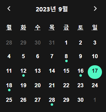
결과
'Frontend > ReactJS' 카테고리의 다른 글
| [React] 합성 컴포넌트 패턴으로 모달 만들기 (4) | 2024.06.12 |
|---|---|
| [React] useCallback vs useMemo (1) | 2023.09.21 |
| [React] Styled-components에서 스크롤 애니메이션 구현 (0) | 2023.08.31 |
| [React] React 반응형 웹 (0) | 2023.02.23 |
| [React] 로그인 Refresh Token 처리 (0) | 2023.02.22 |


